
User Research, Information Architecture, Wireframe, Adobe xd

User Research, Information Architecture, Wireframe, Adobe xd

Hannah Riley
UX & Product Designer

Hannah Riley
Designer & Illustrator
Digi-Prex
Pharmaceutical prescription app
Group Project with
Sara Tulloh & Jorge Vargas
User persona, User Journey,
Wireframes, Information
Architecture, User Testing, Figma
2-week project , 2019
Intro:
Digi-Prex is an Indian start-up company functioning as an online subscription pharmacy that serves patients with chronic diseases. Patients share their prescriptions through WhatsApp allowing medication to be delivered to their door-step as well as to be able to re-order their medication.
Challenge
In our UI/UX Computer Science class our challenge was to select a recent start-up company and design an interface for the start-up that will enhance and create an easier experience for users.
Design Solution
To design an app for Digi-Prex that allows users to easily upload their prescriptions, order and re-order medication. Additionally, further make this experience easier by having reminders to take medication, order new supplies, get a new prescription, and order over the counter medication from the pharmacy.
Who is impacted by this interface?

Doctor

Pharmacist
Doctors will be indirectly impacted by the interface as they are the ones providing the prescriptions. The doctors do not have to refill their prescription for the patient in person, it can be done through the app.
Pharmacists will be directly impacted by this interface because people will no longer need to come in person to the pharmacy. Every step and transaction would be done through the app.
The pharmacist reads the prescription provides by the doctor

The pharmacist
provides the medication for
the patient
The doctor checks the
patient and provides the
prescription
Patient
Patients are directly impacted by
the interface as it allows them to make
orders on the go without having to
make a trip to the pharmacy, as well as
check notifications and notes to track
their medication schedule.
What are the ethical implications that should be considered?
Our interface should be able to incorporate the pharmacist and the pharmacy within the interface. Even though the interaction is not happening in person the customer should still be able to interact with the pharmacist to make sure they are still getting what they need. The group that is being indirectly affected by the app are the doctors. Doctors are still providing a prescription however their prescription is now being used through an app rather than in person at a pharmacy. Our app must keep the safety and privacy of a prescription code because it deals with more sensitive information. The app should take into consideration people's privacy and sensitive information.
User Persona


Wireframes
Each member of our group developed their own set of wireframes in the ideation phase to provide us with multiple design routes and directions that we can go in and work with.
1.
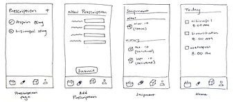
2.

3.
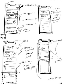
By reviewing each other's wireframes we developed final main wireframes together based on our previous three taking features we thought functioned best and provided an easy and seamless experience for the user.

Information Architecture

User Testing
For the first part of our user testing, we used UserTestin.com and submitted our prototype to have strangers who are given no pre-information about our application except for what it is used for. Users tested our app by completing and rating various tasks that we have given them.
The tasks we gave them were:
1. Upload your prescription and make an order
2. Check to see how close your package is to arrive
3. Check your calendar to see if you have taken your medication
Followed by these questions after each task:
Did you complete the task successfully?
Rate how easy the task was out of 5
In our user testing, we evaluated the completion rate, user satisfaction,
error count & type task 1, error count & type task 2, and time on
task (seconds).


Results and Feedback
-
Overall users said the app seemed realistic and convenient
-
There were certain features they either found confusing or not as intuitive- although the app is not a fully functioning prototype (a code was already provided so some users were not sure if they did the task correctly)
-
Most errors made was on the memory task, users forgot what pages would take them to where
-
Certain icons did not come across as clearly, such as the little triangle to open and close details on the tracking page

(Screenshots from the videos of our user testings)
Class Feedback and User testing
Four different groups from our UIUX class got together and user-tested each other's
interface and provided feedback on how it can be improved or to what parts could be
more intuitive.
This icon is suppose to be settings but it also looks like a menu, the hierarchy can be confusing as there is also a menu at the bottom of the screen.

Too crowded, maybe place one of the pages in settings
Be careful of what sensitive information you place on the home page.
-
The opinion of having the menu icons was divergent, some understood it while others didn't
-
They wanted an example of how you would get notifications on your phone
-
They were concerned about the ethical implications of having medical information on the home page
-
Overall, the class agreed the main task of uploading and reordering was simple to complete
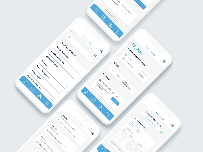
Final Prototype


Login & User Profile
Home Page

A PIN code or Touch ID is required before entering the app to keep personal information private
The most important information is displayed on the home page where users can check off their medication for the day, see if a reorder needs to be made, and can directly upload new prescriptions.
- - - - - - - - - - - -
- - - - - - -
- - - - - - -
- - - - - - - - - - - -
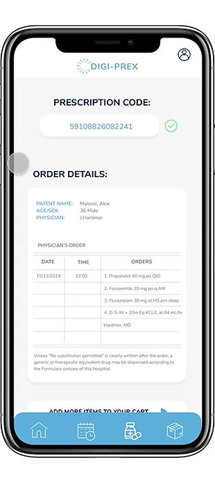
Upload Prescription
Users can insert the code that is written on the prescription from their doctor
Their prescription will verify the code and upload a digital version of their prescription
Users can then either proceed to confirm their order or add other medication to their order that does not require a prescription
- - - -
- - - -
1.
2.
3.

Shop and add to your order
Users can add other medications that you can buy over the counter at a pharmacy. Users are able to review specific details about the product and can also call the pharmacy if they need help finding a specific type of product or medication.

You can clearly track your order from when the prescription is received to when it is out for delivery, as well as your estimated arrival date.
Easily track the progress of your order
- - - - - - - - - - - -
- - - - - - -
- - - - - - - - - - - - - - - -
- - - - - - -
Daily Calendar & Notifications

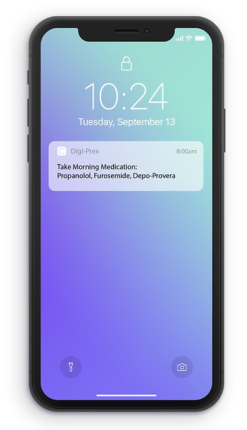
Check to see if you have taken all medication for the day, and keep track of updates and when medication needs to be re-ordered.
If the user forgets to check Digi-Prex, it will send you a notification each day to remind you to take your medication.
- - - - - - - - - - - -
- - - - - - -
- - - - - - -
- - - - - - - - - - - -
Project Reflection
This was my first UI/UX project working in a group, and I really enjoyed it because we were able to collectively think of more ideas and directions to go in. What was most engaging during this project was being able to get User Testing online where we had the opportunity for people to test it without having any previous knowledge of how the interface works. As well, as being able to be in a group setting and have our peers critique our interface. The next step in this project would be to get more user testing to receive feedback on new features within the online store and how the calendar can be more effective for users.